Frequently Asking Questions
General Style
How to Change the Layout Theme ?
open reducer.tsx
path:(shared\redux\reducer.tsx).
Theme Array Documentation
The theme array provided below is designed to control the layout and styling of a web application. By modifying the values in this array, you can change the visual appearance and behavior of various components in the application. The array includes settings related to color schemes, layout styles, header and menu styles, and more.
Initial State
The initial state of the theme array defines the default values for different aspects of the application's appearance and behavior. These values are used as a starting point and can be dynamically modified using the provided functions.
let initialState = {
    lang: "en",                 // Default language
    dir: "ltr",                 // Default text direction (ltr or rtl)
    class: "light",             // Default color scheme (light or dark)
    dataMenuStyles: "dark",     // Default menu style (dark, light, color, gradient, transparent)
    dataNavLayout: "vertical",  // Default navigation layout (vertical or horizontal)
    dataHeaderStyles: "light",  // Default header style (light, dark, color, gradient, transparent)
    dataVerticalStyle: "overlay", // Default vertical menu style (overlay, icon-text, detached, doublemenu)
    StylebodyBg: "107 64 64",   // Default body background color (RGB format)
    StyleDarkBg: "93 50 50",    // Default dark background color (RGB format)
    toggled: "closed",          // Default menu toggle state (open or closed)
    dataNavStyle: "",           // Default navigation style (menu-click, menu-hover, icon-click, icon-hover)
    horStyle: "",               // Default horizontal navigation style (empty)
    dataPageStyle: "regular",   // Default page style (regular or classic)
    dataWidth: "fullwidth",     // Default page width (fullwidth or boxed)
    dataMenuPosition: "fixed",  // Default menu position (fixed or scrollable)
    dataHeaderPosition: "fixed",// Default header position (fixed or scrollable)
    iconOverlay: "",            // Default icon overlay state (empty)
    colorPrimaryRgb: "",        // Default primary color (RGB format)
    colorPrimary: "",           // Default primary color (space-separated RGB values)
    bodyBg: "",                 // Default body background color (empty)
    darkBg: "",                 // Default dark background color (empty)
    bgImg: "",                  // Default background image (empty)
    iconText: "",               // Default icon text style (empty)
    body: {
        class: ""               // Default body class (empty)
    }
};
Theme Modification Functions
to Change the Modification Functions open
landingpageswitcherdata.tsx
path:(shared\data\switcherdata\landingpageswitcherdata.tsx).
The provided functions allow you to modify specific aspects of the theme array, enabling real-time customization of the application's appearance. Below are some of the key functions that can be used to change various theme properties:
Dark(actionfunction): Switches the theme to a dark color scheme. Updates class, header style, and menu style accordingly.Light(actionfunction): Switches the theme to a light color scheme. Adjusts header and menu styles based on the navigation layout.Ltr(actionfunction): Sets the text direction to left-to-right.Rtl(actionfunction): Sets the text direction to right-to-left.HorizontalClick(actionfunction): Changes the navigation layout to horizontal and adapts menu and vertical style based on the color scheme.Vertical(actionfunction): Sets the navigation layout to vertical, adjusts menu and vertical style, and closes the menu if open.Menuclick(actionfunction): Sets the navigation style to "menu-click," hides vertical style, and changes the toggle state.MenuHover(actionfunction): Sets the navigation style to "menu-hover," hides vertical style, and changes the toggle state.IconClick(actionfunction): Sets the navigation style to "icon-click," hides vertical style, and changes the toggle state.IconHover(actionfunction): Sets the navigation style to "icon-hover," hides vertical style, and changes the toggle state.Regular(actionfunction): Sets the page style to regular and removes the classic page style.Classic(actionfunction): Sets the page style to classic and removes the regular page style.Fullwidth(actionfunction): Sets the page width to full width and removes the boxed width.Boxed(actionfunction): Sets the page width to boxed and removes the full width.FixedMenu(actionfunction): Sets the menu position to fixed and removes the scrollable menu position.scrollMenu(actionfunction): Sets the menu position to scrollable and removes the fixed menu position.Headerpostionfixed(actionfunction): Sets the header position to fixed and removes the scrollable header position.Headerpostionscroll(actionfunction): Sets the header position to scrollable and removes the fixed header position.Defaultmenu(actionfunction): Sets the vertical menu style to default, closes the menu, and adjusts the navigation layout.Closedmenu(actionfunction): Sets the vertical menu style to closed, adjusts the navigation layout, and changes the toggle state.iconText(actionfunction): Sets the vertical menu style to icon-text, adjusts the navigation layout, and changes the toggle state.iconOverayFn(actionfunction): Sets the vertical menu style to overlay with icons, adjusts the navigation layout, and changes the toggle state.DetachedFn(actionfunction): Sets the vertical menu style to detached, adjusts the navigation layout, and changes the toggle state.DoubletFn(actionfunction): Sets the vertical menu style to double menu, adjusts the navigation layout, and changes the toggle state.colorMenu(actionfunction): Changes the menu style to color.lightMenu(actionfunction): Changes the menu style to light.darkMenu(actionfunction): Changes the menu style to dark.gradientMenu(actionfunction): Changes the menu style to gradient.transparentMenu(actionfunction): Changes the menu style to transparent.lightHeader(actionfunction): Changes the header style to light.darkHeader(actionfunction): Changes the header style to dark.colorHeader(actionfunction): Changes the header style to color.gradientHeader(actionfunction): Changes the header style to gradient.transparentHeader(actionfunction): Changes the header style to transparent.primaryColor1(actionfunction)toprimaryColor5(actionfunction): Changes the primary color of the theme.backgroundColor1(actionfunction)tobackgroundColor5(actionfunction): Changes the background color of the theme.Themeprimarycolor(actionfunction): Provides a color picker interface to dynamically change the primary color of the theme.Themebackgroundcolor(actionfunction): Provides a color picker interface to dynamically change the background color of the theme.bgImage1(actionfunction)tobgImage5(actionfunction): Changes the background image of the theme.Reset(actionfunction): Resets the theme to its initial state, clearing all customization.
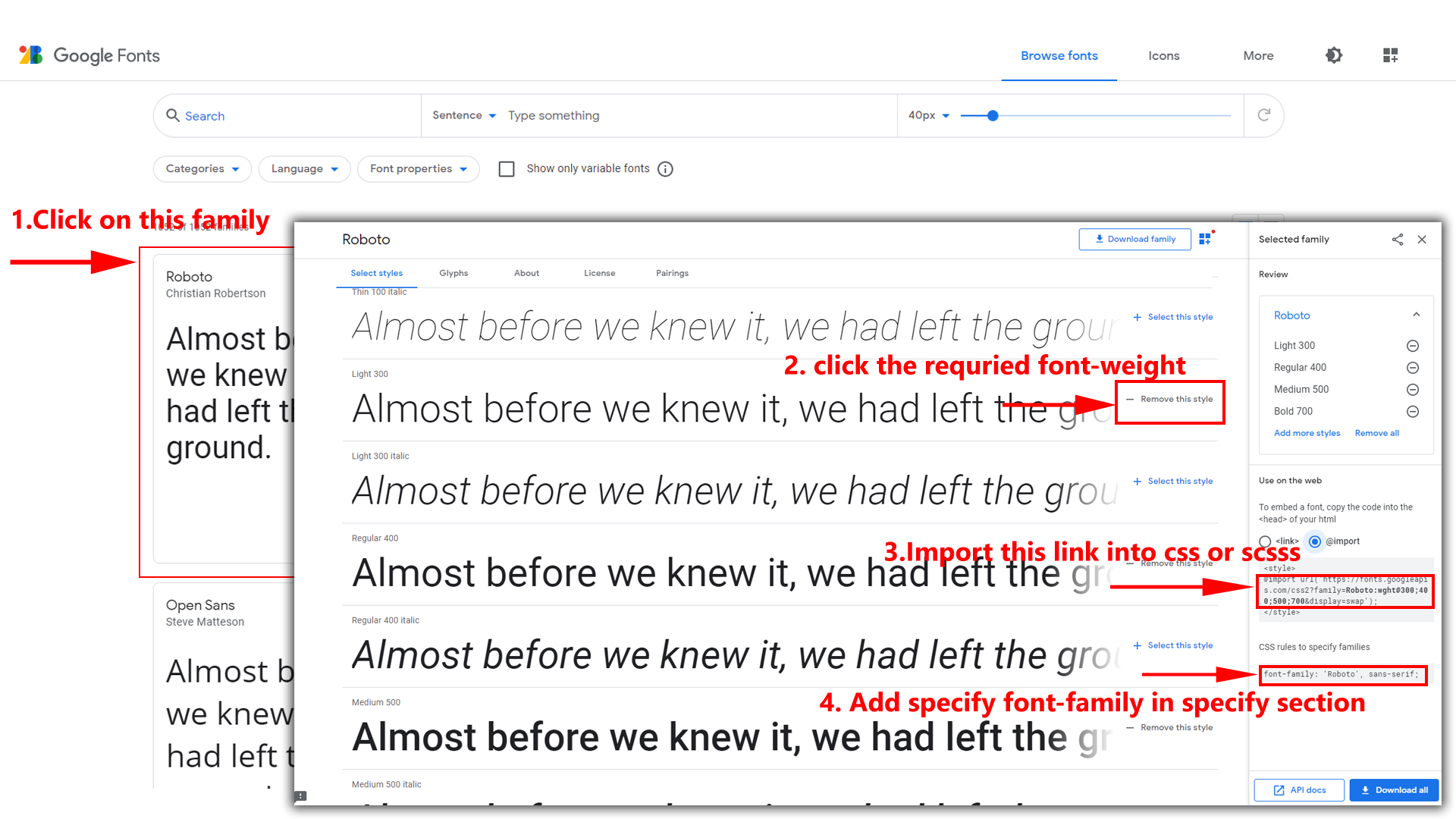
How to Change Font Style ?
Step 1:
Go To style.scss (public/assets/scss/styles.scss )
if you want to change another font-family Go to the site Google Fonts And Select One font Family and import in to styles.scss file
How to Select font Family
Example:
Step 2:
And paste Your Selected font-family in style.scss
Example:

Step 3:
And add the Your Selected font-family in tailwind config file inplace of old font
Example:
fontFamily: {
	inter: ["Inter", "sans-serif"], //place your font here
},
Step 4:
And add the Your Selected font-family to body that is font-inter in custom.scss file (rootpath :- assets/scss/tailwind/_custom.scss) file inplace of old font
Example:
body {
 @apply bg-bodybg h-full text-gray-600 dark:text-white m-0 font-inter font-normal text-sm relative;
}
How to change Menu icons ?
By default menu icons are in the from remix icon if you want to change the icons please follow below steps
Step 1 :
To change Menu icons, open sidebar.html page
Path: shared\layout-components\sidebar\nav.tsx and go
through app-sidebar section, in that section you will find
icontag, there you can replace previous icon with your
icon. Example as shown in below
How to Change Logo ?
Go To "public/assets/img/brand-logos" folder and replace your logo with Previous Logos within in image size. note: Please don't increase logo sizes. Replace your logo within given image size. otherwise the logo will not fit in particular place it disturbs the template design.
Disabling Switcher
How To Disable Switcher In All Pages ?
Step1:
Open header.tsx component
shared\layout-components\header\header.tsx
To remove switcher section as shown below.
<div className="switcher-icon">
   <button aria-label="button" type="button" className="hs-dropdown-toggle inline-flex flex-shrink-0 justify-center items-center gap-2 h-[2.375rem] w-[2.375rem] rounded-full font-medium bg-gray-100 hover:bg-gray-200 text-gray-500 align-middle focus:outline-none focus-visible:outline-none focus:ring-0 focus:ring-gray-400 focus:ring-offset-0 focus:ring-offset-white transition-all text-xs dark:bg-bgdark dark:hover:bg-black/20 dark:text-white/70 dark:hover:text-white dark:focus:ring-white/10 dark:focus:ring-offset-white/10" data-hs-overlay="#hs-overlay-switcher">
     <svg xmlns="http://www.w3.org/2000/svg" className="w-5 h-5 animate-spin fill-headerprime" height="24px" viewBox="0 0 24 24" width="24px" fill="#000000">
       <path d="M0 0h24v24H0V0z" fill="none" />
       <path d="M19.28 8.6l-.7-1.21-1.27.51-1.06.43-.91-.7c-.39-.3-.8-.54-1.23-.71l-1.06-.43-.16-1.13L12.7 4h-1.4l-.19 1.35-.16 1.13-1.06.44c-.41.17-.82.41-1.25.73l-.9.68-1.05-.42-1.27-.52-.7 1.21 1.08.84.89.7-.14 1.13c-.03.3-.05.53-.05.73s.02.43.05.73l.14 1.13-.89.7-1.08.84.7 1.21 1.27-.51 1.06-.43.91.7c.39.3.8.54 1.23.71l1.06.43.16 1.13.19 1.36h1.39l.19-1.35.16-1.13 1.06-.43c.41-.17.82-.41 1.25-.73l.9-.68 1.04.42 1.27.51.7-1.21-1.08-.84-.89-.7.14-1.13c.04-.31.05-.52.05-.73 0-.21-.02-.43-.05-.73l-.14-1.13.89-.7 1.1-.84zM12 16c-2.21 0-4-1.79-4-4s1.79-4 4-4 4 1.79 4 4-1.79 4-4 4z" opacity=".3" />
       <path d="M19.43 12.98c.04-.32.07-.64.07-.98 0-.34-.03-.66-.07-.98l2.11-1.65c.19-.15.24-.42.12-.64l-2-3.46c-.09-.16-.26-.25-.44-.25-.06 0-.12.01-.17.03l-2.49 1c-.52-.4-1.08-.73-1.69-.98l-.38-2.65C14.46 2.18 14.25 2 14 2h-4c-.25 0-.46.18-.49.42l-.38 2.65c-.61.25-1.17.59-1.69.98l-2.49-1c-.06-.02-.12-.03-.18-.03-.17 0-.34.09-.43.25l-2 3.46c-.13.22-.07.49.12.64l2.11 1.65c-.04.32-.07.65-.07.98s.03.66.07.98l-2.11 1.65c-.19.15-.24.42-.12.64l2 3.46c.09.16.26.25.44.25.06 0 .12-.01.17-.03l2.49-1c.52.4 1.08.73 1.69.98l.38 2.65c.03.24.24.42.49.42h4c.25 0 .46-.18.49-.42l.38-2.65c.61-.25 1.17-.59 1.69-.98l2.49 1c.06.02.12.03.18.03.17 0 .34-.09.43-.25l2-3.46c.12-.22.07-.49-.12-.64l-2.11-1.65zm-1.98-1.71c.04.31.05.52.05.73 0 .21-.02.43-.05.73l-.14 1.13.89.7 1.08.84-.7 1.21-1.27-.51-1.04-.42-.9.68c-.43.32-.84.56-1.25.73l-1.06.43-.16 1.13-.2 1.35h-1.4l-.19-1.35-.16-1.13-1.06-.43c-.43-.18-.83-.41-1.23-.71l-.91-.7-1.06.43-1.27.51-.7-1.21 1.08-.84.89-.7-.14-1.13c-.03-.31-.05-.54-.05-.74s.02-.43.05-.73l.14-1.13-.89-.7-1.08-.84.7-1.21 1.27.51 1.04.42.9-.68c.43-.32.84-.56 1.25-.73l1.06-.43.16-1.13.2-1.35h1.39l.19 1.35.16 1.13 1.06.43c.43.18.83.41 1.23.71l.91.7 1.06-.43 1.27-.51.7 1.21-1.07.85-.89.7.14 1.13zM12 8c-2.21 0-4 1.79-4 4s1.79 4 4 4 4-1.79 4-4-1.79-4-4-4zm0 6c-1.1 0-2-.9-2-2s.9-2 2-2 2 .9 2 2-.9 2-2 2z" />
	 </svg>
   </button>
</div>
Step2:
Remove the Switcher component from the main layout
follow the path
shared\layout-components\layout\content-layout.tsx
import Switcher from "./layout-components/switcher/switcher";

<Switcher />
Step3:
Now remove the switcher component and switcherData file from the
root folder, follow the path
Switcher component shared\layout-components\switcher\switcher.tsx
and
switcherdata file from shared\switcherdata\switcherdata.tsx
Note : After completing above steps please run the command to update dist folder.